The Problem with AWS Cost Data
Every CFO and FinOps leader I talk to has the same frustration. They know their cloud costs are growing. They know the data to explain and fix that growth exists somewhere in their AWS billing export. What they lack is a practical way to get into that data and interrogate it at full scale.
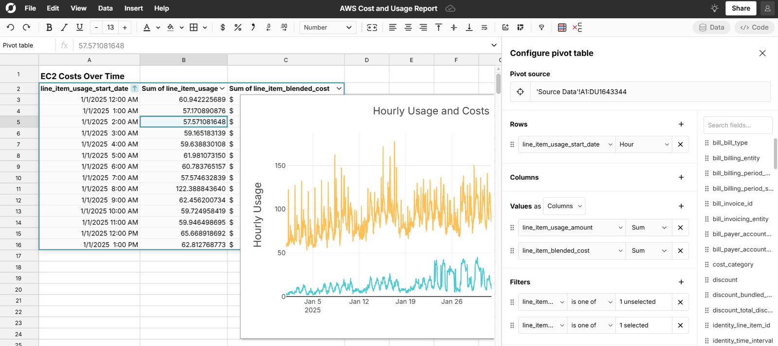
The AWS Cost and Usage Report (CUR) is the most complete record of cloud spend your organization produces. It captures every service, every linked account, every region, and every hour of usage. For a typical enterprise running 30 linked AWS accounts across production and development environments, that translates to roughly 10 million rows of billing data per two-year period.
Excel caps out at just over 1 million rows. Google Sheets crashes before it gets there. So finance and FinOps teams end up working with exports, samples, and pre-built dashboards.
AWS Cost Analysis in an AI-Powered Spreadsheet
Using the Row Zero AI Chat, you paste a prompt, it reads the live data in your workbook, and it returns analysis, pivot tables, and charts directly in a new workbook. No SQL. No Python. No separate BI tool.
The same analysis in Excel, if it were even possible given the row limit, would require data extraction from multiple AWS sources, manual VLOOKUP or Power Query joins, and pivot table construction from scratch for each dimension. And it would still be working from a sampled, incomplete dataset.
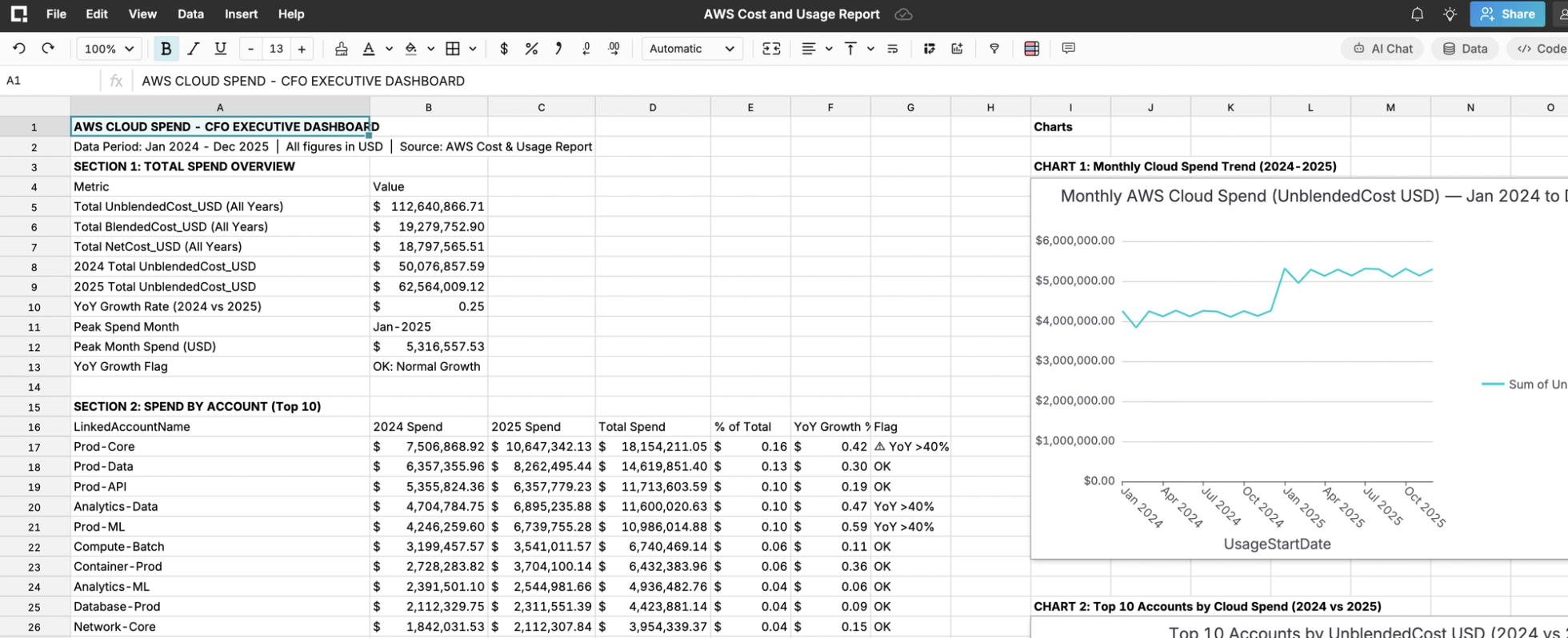
We published a 10-million-row AWS Cost and Usage sample dataset and used the AI Prompt for AWS Cloud Spend for this use case to analyze the full dataset and build a cloud spend dashboard from scratch. Here is what that analysis looks like, chart by chart.
Chart 1: Monthly Cloud Spend Trend
The first view any CFO or FinOps team needs is the trajectory. Is cloud spend growing, stable, or declining? And if it is growing, when did the inflection happen?
The monthly trend chart surfaces what no aggregate annual report can: a significant step-up in cloud spend beginning in January 2025. Monthly spend ran consistently between $4M and $4.2M throughout 2024, then climbed to approximately $5.3M in January 2025 and held at that level through the rest of the year.
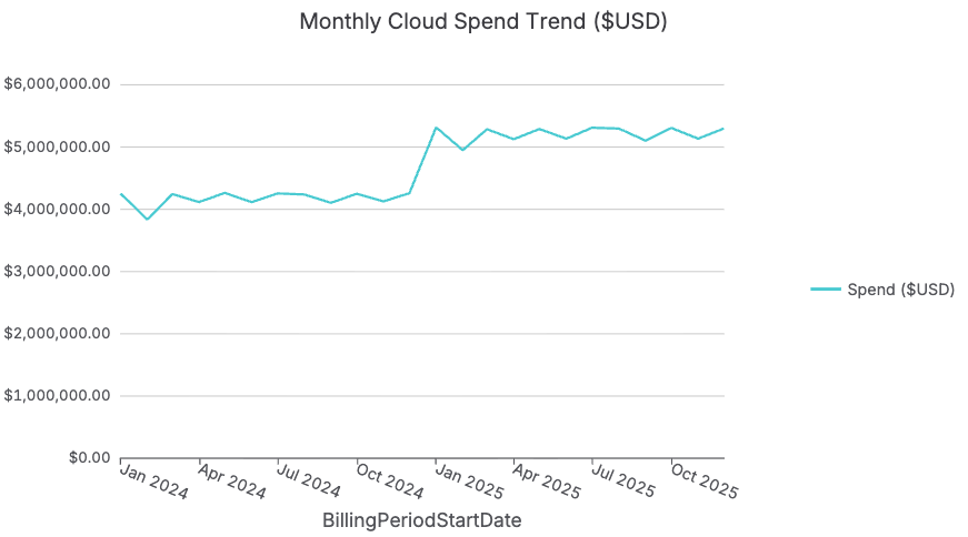
A 30% month-over-month jump sustained for 11 consecutive months is not noise. It is a structural change in the cost base. The CFO's immediate question: what changed in January 2025, and is the corresponding business value proportional? With the full monthly granularity visible in Row Zero, you can drill from this trend line directly into the January 2025 spike, filtering by service, account, and region to pinpoint exactly which workloads drove the inflection.
Chart 2: Total Cloud Spend by Linked Account
With the monthly trend established, the next question for CFOs and FinOps teams is which accounts are responsible. In a multi-account AWS Organization, cost concentration is almost always higher than leadership expects. A small number of accounts typically drive a disproportionate share of total spend.
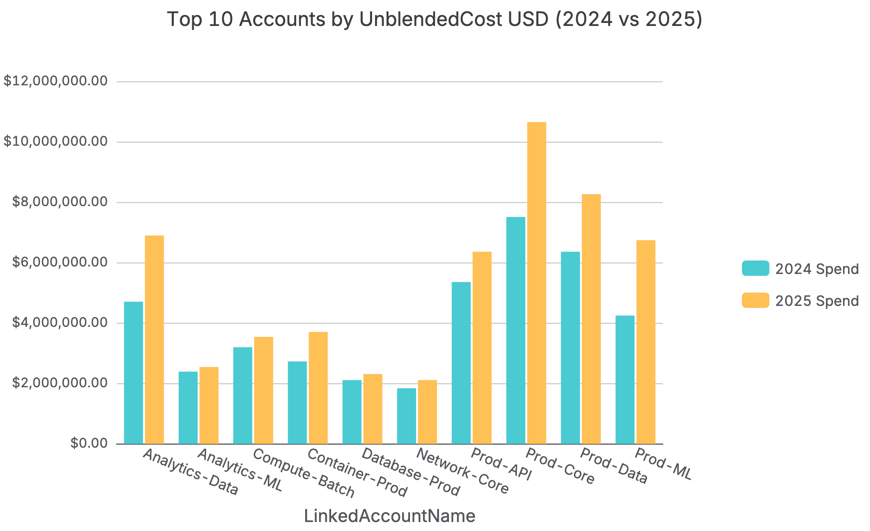
The account-level view confirms what the trend line hinted at: production accounts dominate spend, as expected, but the magnitude of concentration is striking. Prod-Core alone approaches $19M in total spend across the period. Prod-API is close behind at approximately $14M.
The prompt flags this immediately. What would be invisible in a quarterly aggregate report is now explicit: any Reserved Instance or Savings Plan coverage gap in Prod-Core carries 10x the financial impact of the same gap in a development account. That is where FinOps investment priorities should start.
Chart 3: Account Spend Year-Over-Year Comparison
Total spend by account tells you where money is concentrated. The year-over-year comparison tells you where growth is accelerating, which is the more actionable question for a CFO or FinOps leader building next year's cloud budget.
The YoY comparison surfaces Network-Ops as the fastest-growing account in absolute dollar terms. Prod-Core's growth is substantial in absolute dollars and consistent with the monthly trend inflection.
The prompt automatically flags any account where year-over-year spend growth exceeds 40%, giving the FinOps team a clear, prioritized list for the next cloud cost governance review without any manual calculation.
Chart 4: Total Cloud Spend by AWS Service
Knowing which accounts are expensive tells you where to look. Knowing which services are driving costs tells you why and what levers exist to reduce it. This is where CFOs and FinOps teams find their highest-ROI optimization opportunities.
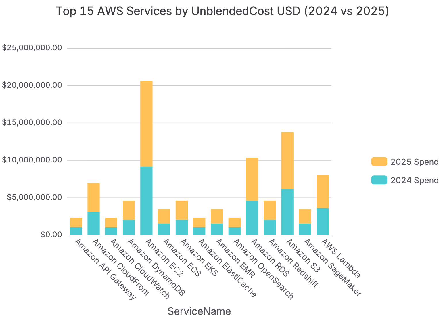
Amazon EC2 is the largest single cost category at over $20M in total spend, and the service with the most optimization potential through Reserved Instances and Savings Plans.
Amazon SageMaker at over $13M is the second-largest cost center, larger than Amazon RDS and Amazon S3 combined. ML training and inference costs have grown substantially and may be flying under the radar of a CFO who still thinks of SageMaker as an experimental line item.
Amazon Redshift at approximately $10M represents a significant data warehousing cost that, with proper Reserved Instance planning, could see 30 to 45% cost reduction. These are exactly the conversations the service-level view enables and that are invisible in a top-line cloud spend number.
Chart 5: Service Spend Year-Over-Year Comparison
The service-level year-over-year comparison answers the question every CFO and FinOps team should be asking before the next annual budget cycle: which services are growing as a percentage of total spend, and is that growth intentional?
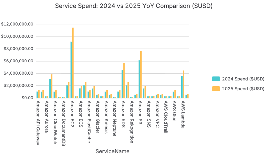
Chart 6: Cloud Spend by AWS Region
Regional spend concentration matters to both CFOs and FinOps teams for two reasons: data residency compliance and cost optimization. Workloads concentrated in a single region create compliance risk if data residency requirements change and pricing inefficiency when some AWS services cost more in certain regions.
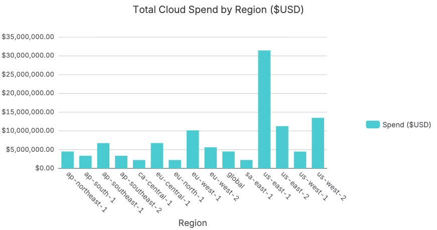
The regional distribution shows clear concentration in us-east-1, AWS's oldest and typically lowest-cost region. At over $30M and approximately 30% of total spend, the prompt's risk flag threshold triggers immediately.
This concentration is not necessarily a problem, but it is a governance question worth asking: is this concentration intentional architecture, or has it grown organically without a deliberate multi-region strategy? The CFO should know the answer before a compliance team asks it.
Chart 7: Cloud Spend by Cost Model
This is the chart that usually produces the most uncomfortable silence in a CFO or FinOps review. The cost model breakdown shows the split between On-Demand pricing, what you pay when you have no commitment and no discount, and optimized pricing through Reserved Instances, Savings Plans, and Spot.
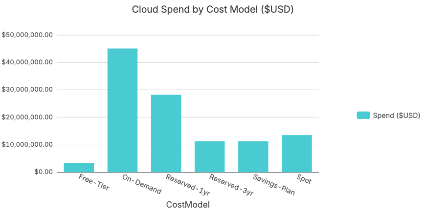
On-Demand spend exceeds $45M, more than all commitment-based pricing combined. Reserved 1-year and 3-year instances account for approximately $29M and $11M respectively. Savings Plans add another $11M. Spot contributes $13M.
A significant portion of organizational cloud spend is being paid at list price without any commitment discount. For workloads that run consistently, including EC2 instances powering production applications, RDS database clusters, and Redshift nodes, this represents a 20 to 45% cost reduction opportunity that requires no architectural change, only a procurement decision.
If the organization shifted even 20% of On-Demand spend to Reserved 1-year pricing at a 30% average discount, that is over $2.7M in annual savings. The data to make that case is here. The conversation with the CFO and FinOps team just became very straightforward.
Chart 8: Service Spend by Cost Model Composition
The aggregate cost model chart shows the opportunity. The composition chart by service shows exactly where it lives: which services have the highest On-Demand concentration and therefore the most accessible savings for FinOps teams to capture.
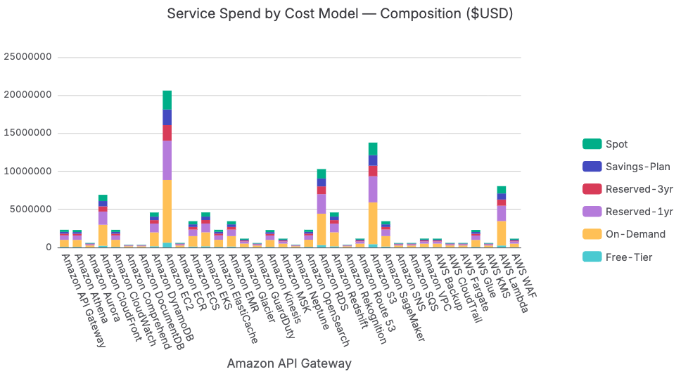
The stacked composition chart surfaces which services are running predominantly On-Demand. Amazon DynamoDB shows a particularly high On-Demand share relative to its total spend. DynamoDB's reserved capacity model can deliver 20% savings with one-year commitments, and the prompt flags this automatically when On-Demand percentage exceeds 60%.
Amazon EKS and Amazon Neptune are additional flagged services. The prompt automatically identifies every service where On-Demand exceeds 60% of spend and surfaces them as the Reserved Instance and Savings Plan conversion priority list.
Chart 9: Savings Achieved vs. On-Demand Equivalent
Every CFO wants to know two numbers: how much is the organization saving today through its FinOps program, and how much more is available? This chart answers both.
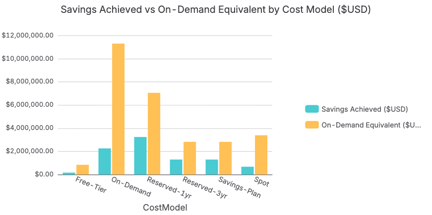
For the On-Demand cost model category, the on-demand equivalent exceeds $11M, meaning these workloads are paying full list price with no discount and could theoretically save $2 to $5M annually with commitment-based pricing.
For Reserved-1yr instances, the savings achieved versus the on-demand equivalent demonstrates the discount model is working. But the volume of Reserved coverage relative to total On-Demand spend shows how much further the organization could go. This is the chart that makes the Reserved Instance and Savings Plan business case to the board in a single image.
Chart 10: Cloud Spend by Environment
Of all 12 charts, this one typically produces the most immediate action from FinOps teams. Environment spend breakdown is where organizations most consistently find fast, low-risk cost reduction: non-production environments running 24 hours a day when they only need to run during business hours.
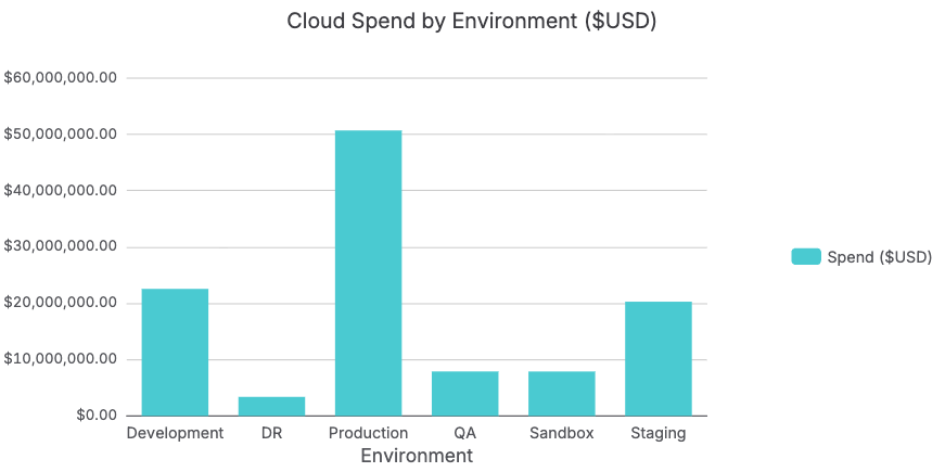
Development and Staging environments together account for over $42M in spend, more than 80% of the Production environment total. QA and Sandbox add another $16M.
Non-production environments running continuously is one of the most pervasive and correctable inefficiencies in cloud spend. Development environments actively used only during business hours could be auto-suspended outside those windows, representing a significant reduction for those workloads. Even a conservative auto-suspension policy could represent over $12M in annual savings from Development and Staging alone. The prompt surfaces this calculation automatically in its environment waste analysis.
Chart 11: Cloud Spend by Team
Cloud cost accountability requires that every dollar of spend be traceable to a team. Without team-level visibility, there is no mechanism to hold engineering teams responsible for cost efficiency and no way to reward the teams doing FinOps well.
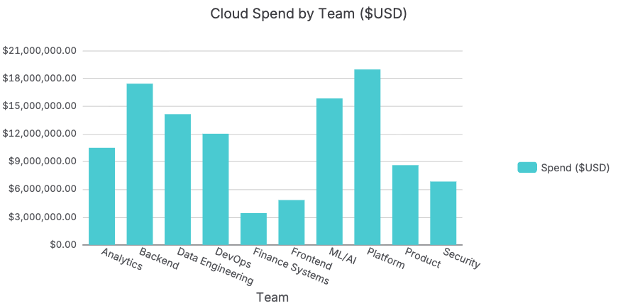
The team-level breakdown establishes cost ownership. Platform and Backend are the two largest consumers, expected given their responsibility for core infrastructure. The ML/AI team at approximately $16M reflects the SageMaker and feature engineering costs visible in the service-level analysis.
Armed with team-level data, CFOs and FinOps teams can have a fundamentally different conversation with engineering leadership. Instead of saying cloud costs are too high, the conversation becomes: the ML/AI team's spend increased 35% year-over-year. Is that aligned with the model training roadmap? Data transforms the conversation from adversarial to collaborative.
Chart 12: Cloud Spend by Project
The final chart connects cloud spend to business outcomes. Projects are the natural unit of strategic investment, and project-level cloud cost visibility is what enables CFOs and FinOps leaders to ask whether each dollar of infrastructure spend is generating proportional business value.
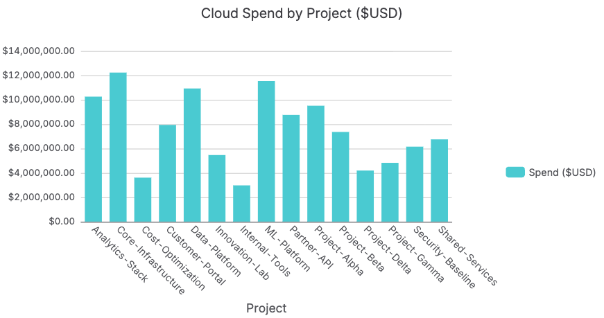
Core-Infrastructure and ML-Platform are the two largest projects by spend, consistent with everything visible at the service and team level. The distribution across 15 projects is relatively balanced, with most projects in the $4 to $12M range.
One data point worth noting: Cost-Optimization is the smallest project budget of the 15, at approximately $3M, significantly less than any other project. The organizational irony of underfunding the project responsible for reducing cloud costs is not lost on FinOps practitioners. This is exactly the kind of insight that only surfaces when you can analyze all dimensions of the data simultaneously, something that is simply not possible in Excel or Google Sheets at this scale.
How Row Zero AI Chat Transforms Cloud Cost Analysis
The 12 charts in this analysis were built using Row Zero AI Chat with a single structured prompt. That is the real story here, not just the scale of the dataset, but what becomes possible when AI-powered analysis runs inside the world's fastest spreadsheet against 100% of your billing data.
Row Zero AI Chat reads the live data in your workbook and returns structured analysis, ranked tables, risk flags, and executive summaries directly in the spreadsheet interface. For CFOs and FinOps teams, this changes the workflow fundamentally. Instead of waiting for a data team to prepare a report, any finance or FinOps analyst can open the full AWS Cost and Usage dataset, paste Prompt CFO-01, and receive an 8-section cost governance analysis covering accounts, services, regions, cost models, environments, teams, and projects in a single output.
Because Row Zero is 100x faster than Excel or Google Sheets on large datasets, the AI Chat analysis runs against all 10 million rows rather than a sampled subset. Every insight is based on complete data. Every risk flag reflects the actual billing record, not an approximation. For organizations making cloud spend decisions in the millions of dollars, the difference between analyzing 5% of the data and 100% of the data is not a marginal improvement. It is the foundation of trustworthy financial governance.
FinOps teams using Row Zero report that analyses that previously required multiple days of data preparation, manual joins across billing exports, and iterative pivot table rebuilds now happen interactively. The AI Chat prompt handles the analytical framework. Row Zero handles the scale and performance. The FinOps team focuses on the decisions.
The Cloud Spreadsheet Built for AWS Cost Analysis at Scale
CFOs and FinOps teams have the same core challenge: the AWS billing data that contains all the answers is too large for the tools that finance teams use every day. The AWS Cost and Usage Report is not a spreadsheet problem. It is a cloud-scale data problem that requires a cloud-scale spreadsheet.
Row Zero gives CFOs and FinOps teams the connectivity to live AWS billing data from the AWS billing console via a data export or S3 connection. To see this analysis running against your actual AWS billing data, schedule a demo and we will walk through it together.